WSP Solutions Magazine (Nov 2012)

Part of me likes this playing with opposites. It's cool to try bring fashion (vanity) and carbon efficiency (sanity) together. We shouldn't regard either as unnecessary. The cover approach does shake one's thinking up a bit.


During my visit to WSP Group here in Helsinki I picked up some of their publications. Here's a review of their Nov 2012 "Solutions" magazine.
The initial feeling is Wow - glossy, haute couture style fashion pictures. How does this go together with the theme of sustainability?
In bright white the cover says: "Designing Future Cities"
In coal black it says: "From Low Carbon to High Fashion"

But. It's mostly the glossy, recycling-unfriendly material of the physical paper that makes me think "it's all just PR". These people are not really there for the long haul sustainability, they're simply giving lip service because that's currently "fashionable". Changing the paper quality of their publication would help them be more credible.
Page 2-3

The inside is more light in colors, with the normal green / yellow / orange / blue pastel color scheme going throughout. To me, this feels slightly fake. The easy way out. All the graphics look "nice" by themselves, but they are the usual clipart that can be added to any environmental, urban article. Nothing WSP about them (probably the whole layout and/or editing of the magazine has been outsourced - this is what one gets - a generic magazine). Did WSP want that? Or would they want more of their feeling to it? Now, if I were a customer, and didn't read any of the text, this would be a completely ignorable experience.
The above is probably due to my experience as a startup pitcher. We're taught to be rememberable, unique, honest. It wouldn't be too much to ask that to show in big corporations, as well?
Then to the text - and this is where it gets better.
Short story on WSP + Genivar merger. Great, not too long, written from the customer's point of view (what are the benefits).
Sample on a "win" they've gotten in Ontario, Canada. The practical cases are always good, and there are plenty more in this magazine. We want to work with companies who are successful.
Short review on -5% carbon emissions, titled as "strong progress". Well, from where I see it it's more of "a start" and "good intentions". A company such as WSP should strive for -50% or more reductions. The problem with telling -5% (yearly) reduction is that they're basically saying "we're no worse than the others". In fact, they do say "We continue to benchmark our performance against other companies". This is just safe betting - a vigorous approach would aim at way more. Of course, most of WSP's carbon footprint probably comes through their design work's implications and not from their own office environment. Were I in charge of WSP office sustainability I'd press for full carbon neutrality by year 20xx, and compare to that. Comparing to others in a badly managed planet is not very meaningful.
Also, the small text was on 2011 figures. In a November 2012 magazine. It takes over half a year for such results to surface? Is that the same for their financial reports - don't think so. Same deadlines for sustainability reports as financial ones (another agenda to push for the sustainability responsible of WSP).
Page 3 is general backdrop on urban statistics. The text and the sunny picture are somewhat conflicting.
Page 4-6

Good text.
The WSP personnel really makes a positive impact on me, as a reader. Like this:
"Talented people want to do interesting things in their downtime, they want to know that the world’s best art is down the road, and they want to be proud of the place they live in. They want to live somewhere where they know that their participation in the economic life of a place isn’t having a negative knock-on effect on the environment, and where there are other people like them, with similar talents and ideals."
Seems they hold the individual - the citizen - in great value. And the style of the text overall in the magazine is intimate, concrete and benevolent.
“It comes down to what a city wants to be famous for,” says Toyne. “Is it six-lane highways and gridlock and the fact that it takes four hours to go even a short distance, or for being a free-moving, easily navigable city, accessible to all?”
“Many of the world’s cities are becoming the same,” agrees Brooks. “Retail is a key factor. It used to be a key component of identity, but now you can go to different cities and walk down the high street and you could be in the same place, it’s Starbucks, McDonald’s, Benetton.” He believes there will be a reverse:
This is interesting to read. These people are crafting our urban future, by designing our cities. They smell the trends and here they are conveying those trends back to us, as readers. This is nice.
Maybe blogs have taught people to write better. They will get immediate feedback and criticism. In blogs, you need to be bare and honest. That approach also serves a company magazine (on page 6 is a link to Jason Brooks' blog - unfortunately the link is a generic wspgroupfuturecities.com link and not to any blog. In fact, I failed to find Jason's advertised blog even with 2 minutes of searching).
Page 7

There's a mention on a subject familiar to me - Sibbesborg just 30 km east of Helsinki. WSP has won the design contest and they're informing about what's going to be happening in that development up till 2050.
This leads to an idea for the magazine editors: do follow-ups of such projects, such that there becomes a continuation on how a certain team or a certain project is doing.
Page 8-11


On city identity and iconic architecture. Again, I enjoyed the article. It's a great approach to have multiple different people give their insights. It balances an article. Also, these people seem not to be WSP employees but collaboration partners (architects etc.). This to me tells of an open ecosystem and friendly but effective working habits. A gang one desires to be part of.
The article mentioned the Shard, a previously unknown London skyscraper to me (though I've probably seen it under construction but haven't realized). Made me google things. Now I know. Thanks for raising my curiosity.
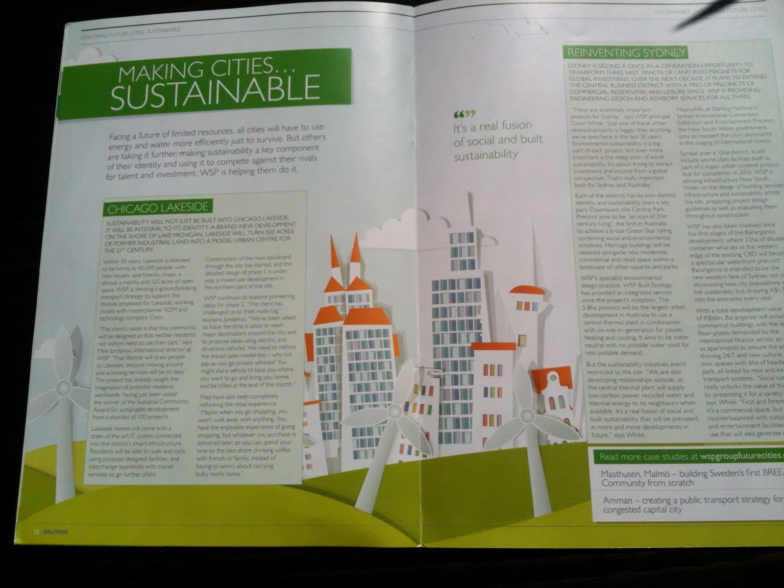
Page 12-13
"taking it further, making sustainability a key component of their identity and using it to compete against their rivals for talent and investment. WSP is helping them do it."
This is interesting. But pictures tell more than words, and again here clipart prevails over anything that would have given context to the Chicago Lakeside or Sidney.
Page 14

Hey, I know this guy! Following @richpalmeris on Twitter.
WSP could actually mention authors' twitter tags if they are active there (even if it's their private and not corporate accounts). Just an idea.
The text is nice and professional, telling of city branding of Cape Town. Suits the magazine nicely and has a complementing approach to the earlier articles. Well done.
By now, the mismatch of visual vs. text is more than obvious. I also realize that none of the actual photos have any humans in them (apart from a portrait on page 2). This must be because it's more difficult to get rights to use identifiable people in a magazine shoot. But this causes a conflict between what WSP is trying to say in "cities are for the people" and showing empty streets (Bristol, page 2) or far away scenery (Capetown, page 14).
Page 15
This is the page showing project wins (as the title says). These are always interesting, but the lack of any visuals to make the data graspable in a glimpse (essential in a magazine s.a. this) is striking. Add i.e. a map of the world highlighting the locations (helps one to focus on areas of his/her interest). Add bars below each win highlighting their budget magnitude (instead of merely giving numbers in the text). I think the visual designers simply skipped this page.
It's also unknown, why the three latest contact backdrops are black, when the others are light green? I thought it might be WSP vs. Genivar (is not). Transportation vs. rest (is, but doesn't make sense). A magazine should use visual cues that make sense to the reader. This one is probably just random, and therefore counterproductive.
The last (Finnish) case is highlighted with light green background. It's about recognition, not project win, and the highlight is supposed to be indicating that. Well, it doesn't. It sits firmly under the "Transportation and infrastructure" section. (Not that I care, but really… layout people… someone actually got paid for doing this "work"?)
Back cover

The back cover tries to draw the loop into conclusion by returning to the "high fashion low carbon" theme of the front cover. It's visually messy, but ok. Finally we have faces. :) I would consider using the back cover for continuity and connection. This is where you want to engage the reader to stay in touch. Maybe give previews of the next magazine's issues (if already decided upon). Push for Facebook, Twitter, Newsletter engagement. Use a QR code for the mobile handset (yeah, none of the bosses use those, but it will make the magazine seem cool and young). There are currently two links here, but neither of them lead to longer term engagement.
Digital copy
Opposite to the paper copy, the digital one suffers from exactly the opposite: too little quality. For some unknown reason, they're linking to a low resolution (4.4MB) PDF that has artifact problems on all of its pictures. This is such a naive mistake. You make a great-looking brochure to only ruin it online. Why, oh why?
a) the people didn't care
b) no boss noticed it
c) no-one reads it online anyways
d) something else
This is part of branding.
Interestingly, WSP has done it right with their older (March 2011) copy. Brilliant finishing.
Summary
The good
+ fresh approach mixing "opposites" of high fashion and low carbon
+ very good, honest, personal, detailed, readable text contents
+ no typos or other stupid mistakes (apart from Jason's non-existent blog)
The bad
- seemingly non-recyclable glossy paper on the physical magazine
- selected layout and clipart pictures are too generic
- non-relevant and too tiny pictures, without faces
- low picture quality of the on-line version
- link to "Jason's Blog" doesn't lead there
Fix the layout and picture issues, plus consider the relevance of a shiny, non-recyclable paper material, and this will rise the overall magazine to the level that its text already is.
The right link to Jason's blog is:
http://wspgroupfuturecities.com/globalblog/2012/09/13/social-sustainability/what-makes-a-winning-city/
http://wspgroupfuturecities.com/globalblog/2012/09/13/social-sustainability/what-makes-a-winning-city/
No comments:
Post a Comment